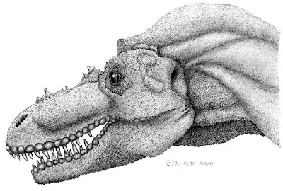
So I needed a paleo-image to put at the top of the post. Rather than give you a crude sketch, I decided to sort throught the dustbin of history. I found a full-color piece -- and found myself compelled to throw a few changes on it. Here was the start of the work, a pencil drawing of what I believe is now known as Gorgosaurus libratus.
Hey, everybody! I forgot to tell you -- the new Art Evolved gallery is up! Go and look at Pterosaurs! There are some swell ones in there -- and you might want to check back on it in a few days. There's still work being posted.
And ol' Glendon Mellow's piece needs to be seen at a larger size. Click here to see it in it's full majesty. The subject matter and handling make me think of Allen St. John's work for Edgar Rice Burrough's fiction. I'll bet it's something to see live.
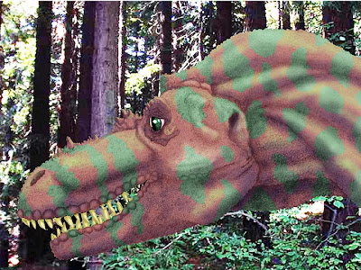
I had some reference photos I'd taken at the Miocene forest at the UC Berkeley Botanical Gardens and figured hey, it was close enough for government work. I colored it using hues selected from the photo using the Eyedropper tool. But I've always been a little unsatisfied with it. I wanted it to look like a snapshot of a Gorgosaurus and it looked like what it was -- a colored pencil drawing on top of a photo. And the overall color of it seemed drab and faded.
When I saw it again, it struck me that I could do something about that. I've got ten more years of Photoshop under my belt. Even if I didn't have the file with the layers on it, there were some global adjustments I could do that would make a difference.
When I saw it again, it struck me that I could do something about that. I've got ten more years of Photoshop under my belt. Even if I didn't have the file with the layers on it, there were some global adjustments I could do that would make a difference.
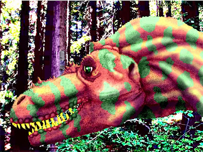
The first thing I did was to beef up the color. I could have done that with an adjustment layer -- Hue & Saturation, Lightness & Contrast, Curves, or Levels could have worked alone or in conjuction with one another.
I had a better idea -- first, I went to Image Mode under the Image menu and changed it to LAB color. Then I added a Curves adjustment layer. When you use curves, you can apply them to the different channels of an image -- in RGB, there's an overall channel for the whole image, then seperate channels for red, green, and blue. In CMYK, there's the same thing going on, only the channels are cyan, magenta, yellow, and black.
LAB color is different. When you use curves in LAB, you have one channel for lightness, and the other two channels control relationships between different colors. Using a cute trick I'd show you if I knew how to make and work with screen captures (which I really need to learn, pronto), I used the curves adjustment layer to punch up the color to get the above result. And by helping the color, I helped the contrast.
LAB color is different. When you use curves in LAB, you have one channel for lightness, and the other two channels control relationships between different colors. Using a cute trick I'd show you if I knew how to make and work with screen captures (which I really need to learn, pronto), I used the curves adjustment layer to punch up the color to get the above result. And by helping the color, I helped the contrast.
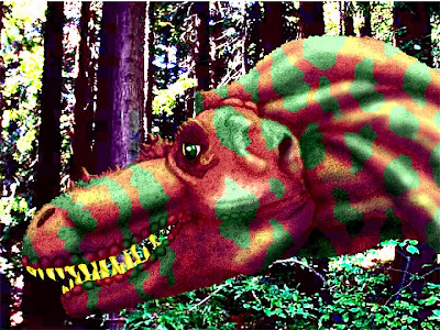
Then I added a Brighness & Contrast adjustment layer, using it to increase contrast even more and to darken the overall image slightly.
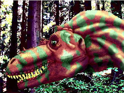
Next came a Hue & Saturation adjustment layer. I left the hue alone but slightly decreased the saturation.

Finally, I converted the image itself to a Smart Object and added an Unsharp Mask filter. While I'd have been able to do a much better job if I'd been messing with the full file, now the image looks a lot more unified to me, as thought the Gorgosaur is in the same space as the forest. And it took less than ten minutes! Still one problem, though. The teeth look like shit.
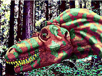
So I added a layer, sampled the yellow of the teeth and generated a color a little cooler and darker than that, set the new layer to Multiply mode, and airbrushed some shadows over the teeth. Since I was using Multiply, that brought out the pencil marks underlying the color. That took me half an hour; I couldn't help myself. The compulsive oaf even went and used some Rubber Stamp tool on a few stray pixels you'll never see. But I think the end result is a great improvement.
Heh-heh-heh. I just glanced at the comparison between this image and the one below and was reminded of my greatest strength and weakness as an artist -- I never do nothing the same way twice.
I'll always remember the time I mentioned to the Monday writing group that my next submission was going to be completely different than anything they'd seen from me before -- and the room erupted in laughter.
When they were able to talk again, they explained to me that everything I did was completely different than anthing they'd seen from me before.
Makes it hard to build a brand.

5 comments:
Pretty awesome transformation, Sean!
Speaking with Laurence Middleton at SciBarCamp, he pointed out that being a generalist is underrated. I see a style in much of your work now that I did not at the beginning, but even so, it's the surprises of how diverse you are that can also build a brand.
I wouldn't worry about that too much. And in a simplistic and short way, I think that strong individual style usually works for a gallery-selling artist, but an illustrator is better off being diverse in style.
(Of course an exception to the former would be Picasso who could do a different style every day of the week...)
With the image, or another one like it, have you thought about floating the original pencils overtop of the colour at a reduced opacity, or in Multiply? That can look pretty similar to what you have there. I like the saturation in LAB colour. That looks pretty awesome.
Now that you mention it, I should have tried re-introducing the pencils to the piece using a blending mode, probably Multiply.
I'm starting to get in the habit of thinking in terms of shows rather than pieced because of the whole gallery thing.
I actually take a great deal of pleasure in eclecticism -- I think of it as having a large creative toolbox. I've got a strong formalistic/experimental itch that I've gotta scratch on a regular basis!
I too love the technique here.
I think what is most impressive about this particular piece is how your painstakingly drawn scales disappear for most of the versions and then suddenly reappear at the end more vivid and detailed then ever!
Awesome stuff!
Thanks for noticing. I'm pretty proud of that, actually.
At that point in time I was a lot more of a draftsman than I am now and I used scales and other details as a means of determining the tones in a drawing.
Now if I could get back to that level of skill in drawing back and combine it with my current ability to do, well, what I did there...
Hey. There's a reason novelists and fine artists usually start doing their major work in their mid-forties. Unfortunately, I'm trying to do both at once.
Unfortunately? Fuck that. Fortunately. If nothing else, I'm having a blast. I'm so glad I stuck with my studies.
goyard handbag
palm angels outlet
bape
kyrie shoes
kyrie 6 shoes
birkin bag
yeezy 700
yeezy
nike kyrie 7
jordan shoes
Post a Comment