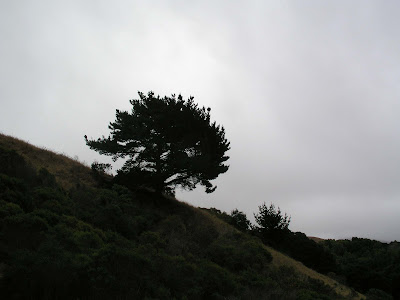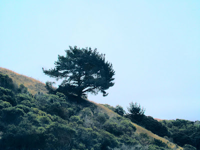

Hmmm. Now that I'm looking at the two in conjunction, I'm thinking that I prefer the palette in the untouched version on top; in addition, all of the sky's subtlety has been eradicated.
Still, the second version does have an old National Geographic quality that I like...
Still, the second version does have an old National Geographic quality that I like...

2 comments:
i'd meant to say earlier nicely done... had a VERY busy week at work.
are you using any special filters in photoshop or this just random little tricks added up together.
Hey, Traumador!
The end result is a matter of little, specific fixes adding together. It's mostly a matter of adjustment layers -- by using those instead of straight adjustments you get the opportunity to go through and make adjustments on everything as you work.
Typically, I'll use Brightness/Contrast, Curves, and Levels. This particular image used three separate Curves layers just because I needed to fiddle a lot.
Post a Comment